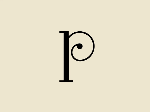
The Borough Press Logo
Black Letter B Abstract Minimalist
What we like: The minimalist lowercase "b" design with bold, sleek lines creates a modern and artistic feel that stands out.
- Color
- Black 956
- Industry
- Publishing 89
- Letter
- Letter B 258
- Location
-
 United Kingdom 367
About the The Borough Press logo
The Borough Press' logo is a modern and minimalist design featuring a lowercase "b". Bold and sleek, the solid black color and curvilinear lines create an abstract and artistic feel. The prominent vertical stroke and pronounced curve offer a clean, sophisticated, and versatile aesthetic, making it visually striking.
About The Borough Press
Operating as part of HarperCollins Publishers, The Borough Press is a fiction imprint dedicated to releasing exceptional writing that represents the forefront of modern fiction. It is home to a roster of bestselling and award-winning authors.