Runnings Logo
Red Letter R Circular Abstract
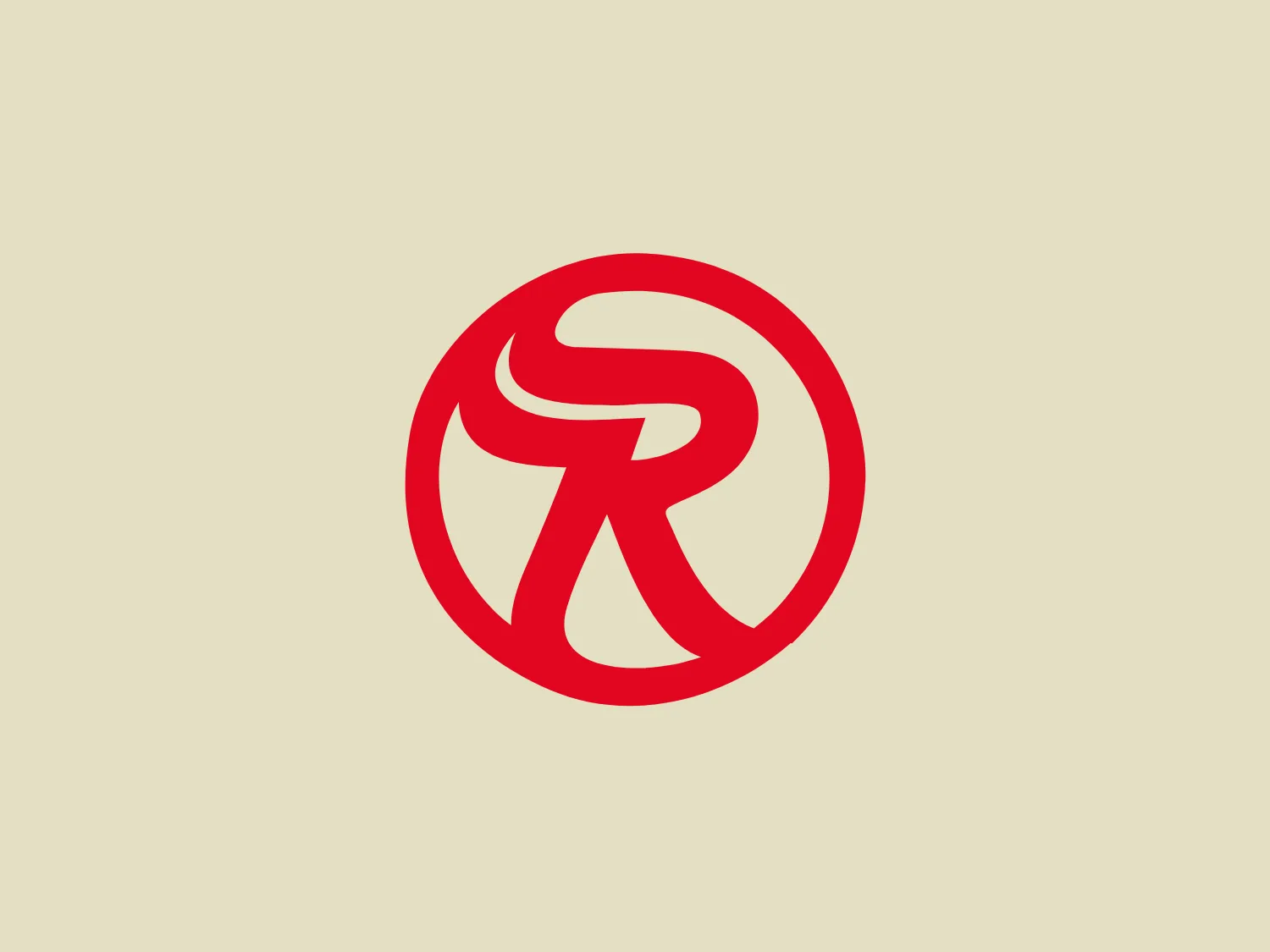
What catches our eye is the modern, dynamic "R" within a circular outline, suggesting motion and energy with a clean and minimalist design that's easily recognizable.
- Color
- Red 1163
- Industry
- Retail 106
- Letter
- Letter R 159
- Location
-
 United States 1682
About the Runnings logo
The Runnings logo showcases a vibrant red, stylized letter "R" within a circular outline. The modern, fluid design of the "R" suggests motion and energy, with a unique negative space that enhances its dynamic appearance. The minimalist approach and singular color give the logo a clean, contemporary, and easily recognizable look, while the uniform stroke thickness contributes to its balanced and strong visual impact.
About Runnings
Established in 1947, Runnings began as an automotive supply store with a primary focus on farm and fleet supplies. During the late '80s, the company diversified its product offerings and evolved into a retail destination, offering a wide range of high-quality merchandise.