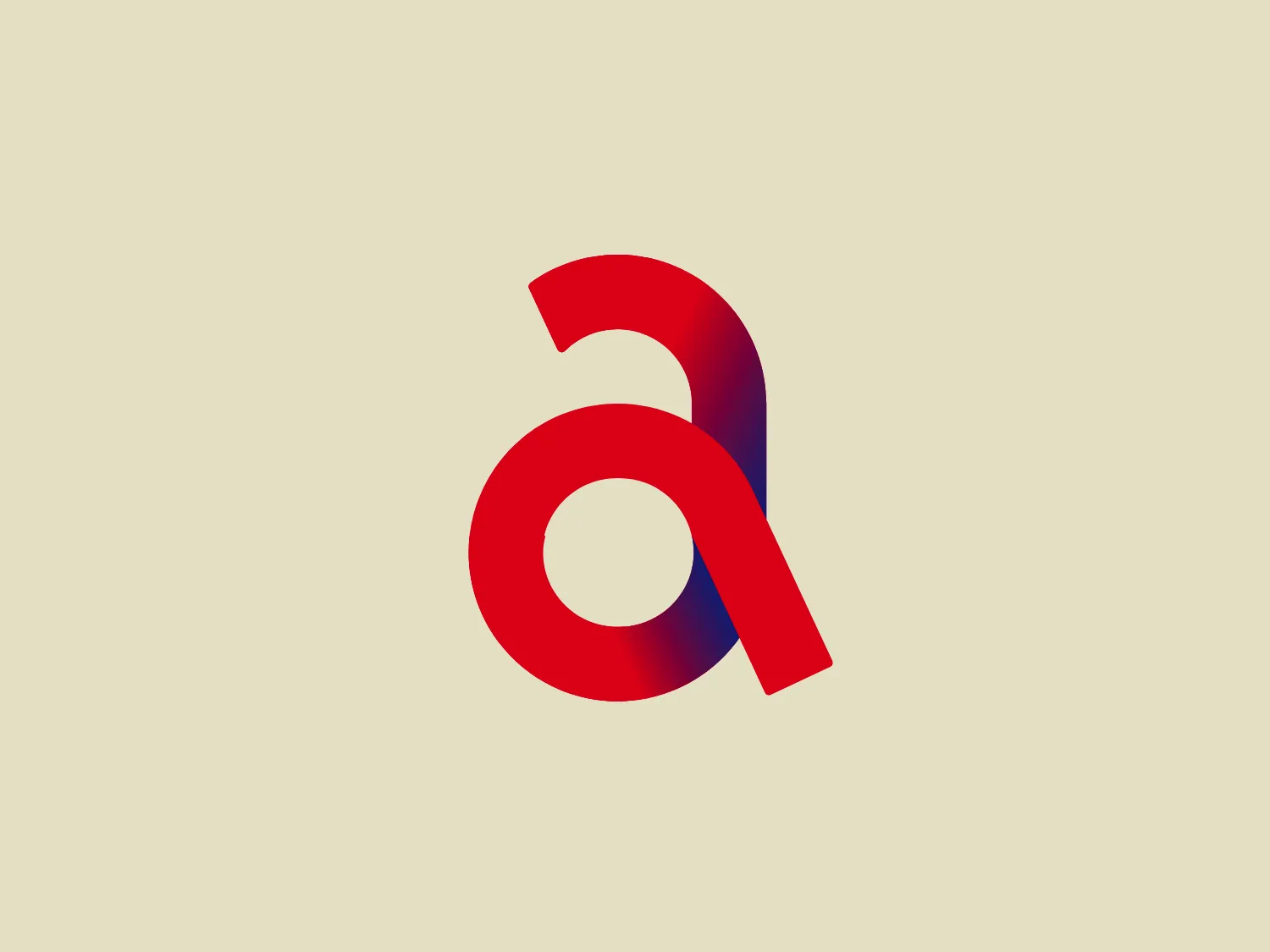
Anhalt University Logo
Red Blue Letter A Abstract Minimalistic
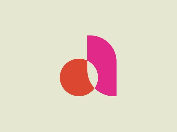
Something we like: The Anhalt University logo's modern "a" design, vibrant red, deep blue, gradient effect, and bold, minimalist presence make it visually appealing and innovative.
- Industry
- Education 219
- Letter
- Letter A 356
- Location
-
 Germany 291
About the Anhalt University logo
The Anhalt University logo features a stylized letter "a" with a modern and minimalistic design. The character is composed of two distinct colors: a vibrant red that makes up the circular body of the letter and a deep blue for the extended tail, which loops below and then stretches upward to the right, suggesting a sense of motion or progress. The colors transition smoothly where they overlap, creating a visually appealing gradient effect. The letterform itself has a bold presence, with the fluid curve of the "a" suggesting accessibility and innovation. The minimalist design foregoes any additional embellishments in favor of a clean and striking look.
About Anhalt University
Anhalt University of Applied Sciences, also known as Hochschule Anhalt, is a highly research-intensive university in the state. The institution is recognized for its unique approach that effectively combines science and innovation.