Kids First Logo
Pink Orange Letter K Abstract Geometric
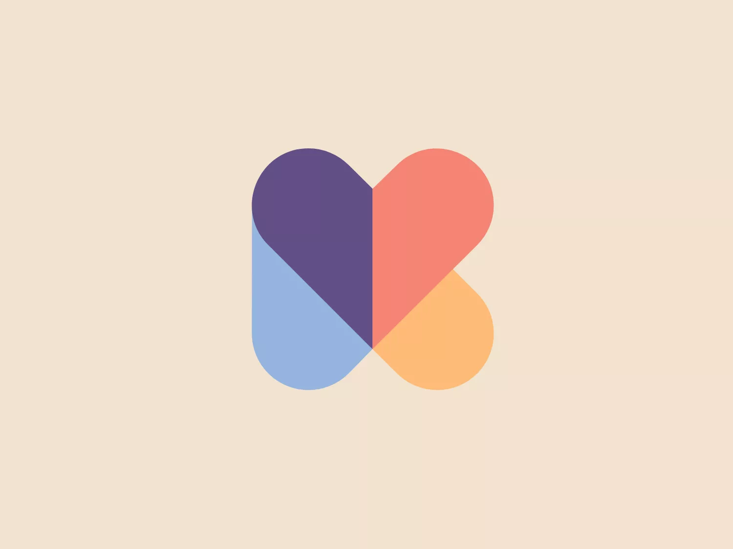
Something we like: The modern and minimalistic Kids First logo with overlapping geometric shapes, creating new harmonious colors and a friendly aesthetic.
- Industry
- Social Services 16
- Letter
- Letter K 182
- Location
-
 Australia 143
Use this logo
The Kids First logo is a trademark of its owner, shown here for design reference only. Request removal
About the Kids First logo
The Kids First logo is a modern and minimalistic design with an abstract heart or letter "B" shape. It features three overlapping geometric shapes: a purple circle, a blue semi-circle, and a pinkish-orange quarter-circle, each with a flat color fill and slight transparency. The overlapping areas create new colors when they intersect, contributing to a harmonious blend of hues, presenting a soft, approachable, and friendly aesthetic. The simplicity and use of gentle, pastel-like colors create a soothing visual experience.
About Kids First
Established in 1896, Kids First has been dedicated to providing essential community care services. The organization aims to enhance the life opportunities of at-risk children, youth, and families through nurturing and support.