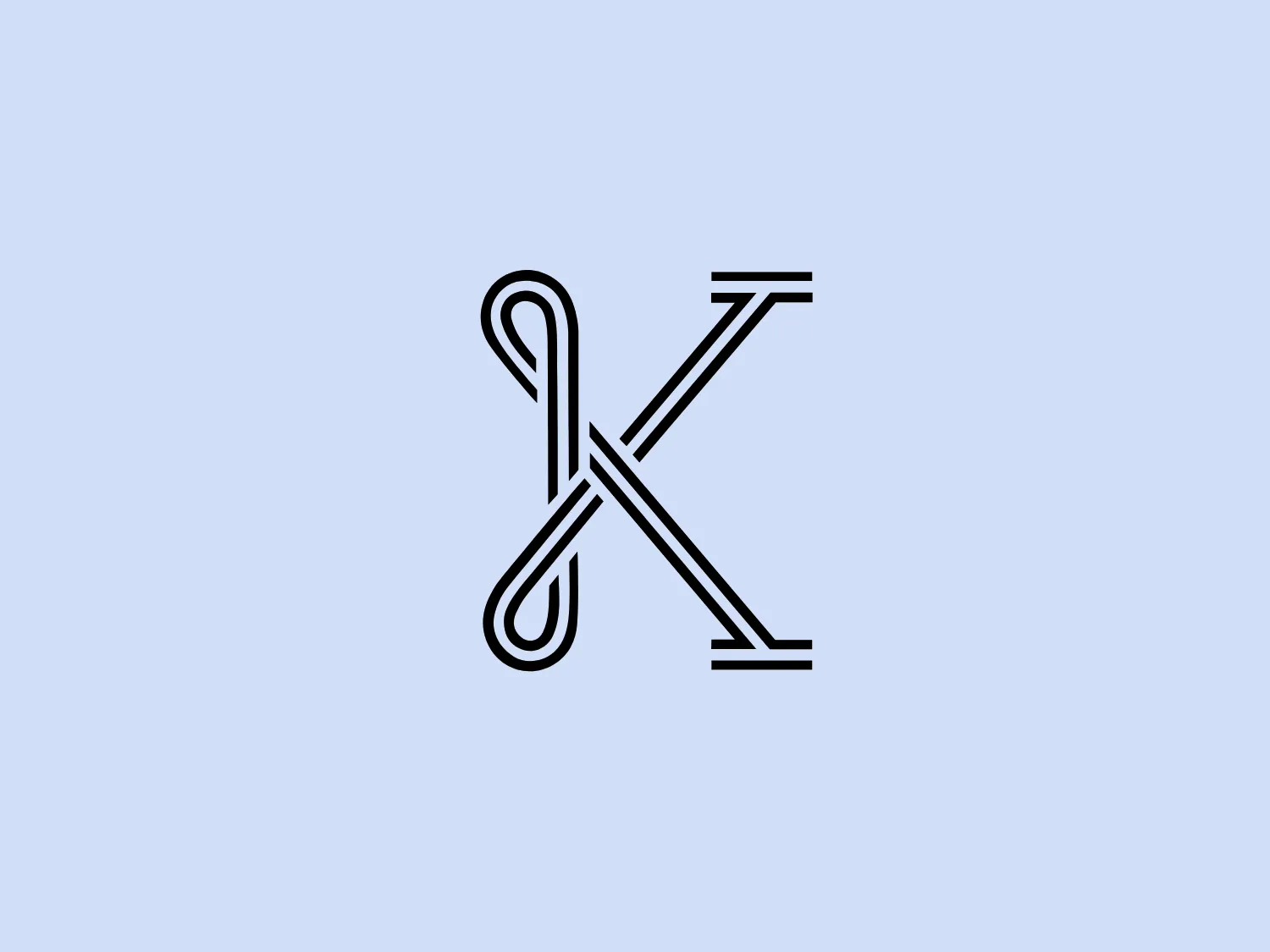
Kitsbow Logo
Letter K Interlocking Geometric
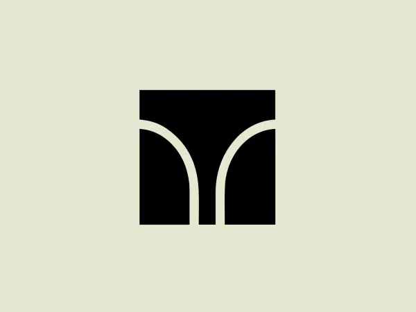
Something we like about the Kitsbow logo is its sleek and modern design, combining the letters 'K' and 'X' in a unique and intertwined manner.
- Industry
- Apparel 71 Fashion 87
- Letter
- Letter K 187
- Location
-
 United States 1737
About the Kitsbow logo
The logo for Kitsbow is a stylized, monochromatic design that combines the letters 'K' and 'X' in a unique and intertwined manner. The sleek and modern aesthetic features thick, uniform lines and sharp angles. The 'K' is noticeable through the vertical and diagonal strokes, while the 'X' is incorporated through the crossover of lines. The overall look is minimalistic yet sophisticated, suggesting a contemporary brand identity.
About Kitsbow
Kitsbow specializes in the design and manufacture of premium mountain bike apparel, focusing on refined, minimalistic details in an industry typically characterized by a rugged, earthy aesthetic.