Hudson National

15
Something we like about the Hudson National logo is its bold and stylish depiction of the letter "N" with a unique geometric design, creating a modern and minimalistic aesthetic.

Letter

Type

No items found.

Color

Hudson National Logo

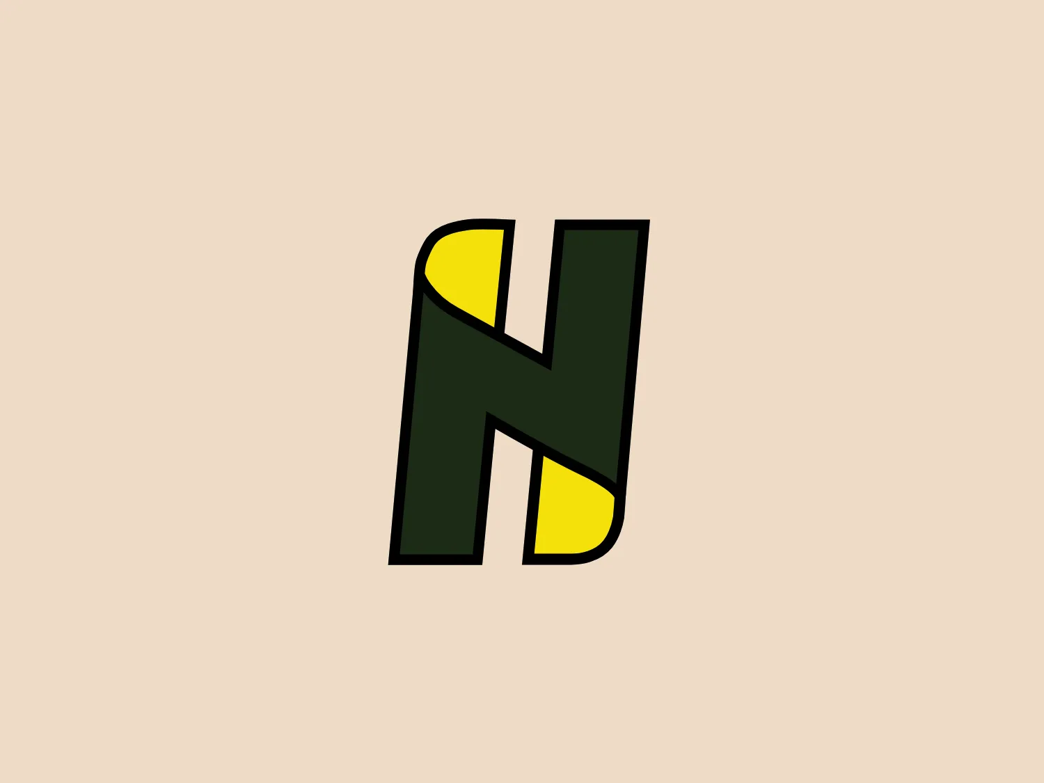
The Hudson National logo presents a stylized letter "N" depicted in bold, with a unique geometric design. It combines dark green and vivid yellow shapes, creating a contrast that gives the appearance of depth and dimensionality. The green part of the "N" has two vertical elements and a diagonal stroke connecting them, while the yellow fills in the negative space, enhancing the visual impact. The overall aesthetic is modern and minimalistic with a slightly playful twist due to the unconventional use of color blocking. This logo seems appropriate for a brand looking to convey innovation and energy.

About Hudson National

Hudson National Golf Club is a premier private golf club located in New York State. The club features a traditional course that harmoniously blends with the natural landscape, providing a nostalgic and timeless golfing experience. Sports and Recreation

Similar logos

The Matsuura logo features a stylized depiction of three overlapping, rounded shapes in a vibrant green color. The design exudes a modern and minimalist aesthetic with a nod to nature or growth themes, implying movement and connectivity. The shapes suggest leaves, pebbles, or abstract representations of increasing value/momentum.
The Breitling logo depicts a stylized, fluid letter "B" with elongated, curved strokes, giving it an elegant and dynamic appearance. The design is minimalist, using a bold golden yellow color that suggests luxury, quality, and sophistication. The overall aesthetic is modern and sleek, with a sense of movement and possibly creativity, hinted by the smooth lines that evoke a sense of continuity. Given the vibrancy of the golden hue, a subtle and light background would complement it well without competing for attention.
The BitX Capital logo showcases a stylized, abstract design with a dynamic feel. It comprises interlocking shapes resembling a three-dimensional impossible loop. The main elements consist of two intertwined ribbons with a gradation of green shades that provide a sense of depth and movement. The contrast between the lighter and darker greens enhances the interweaving effect. Overall, the logo presents a modern and clean appearance, suggesting innovation and connectivity.
The Subway logo features two bold, interlocking arrows forming an 'S' shape, with the top arrow colored in a striking green and the bottom in a vibrant yellow. The design is clean and modern, with a dynamic sense of movement implied by the arrows pointing in opposite directions. This creates a sense of exchange, circulation, or progression, which might suggest a company involved in logistics, technology, or finance. The flat color treatment and lack of additional embellishments give it a contemporary and straightforward aesthetic.
The Holiday Inn logo features a stylized, abstract design that appears to be a pair of overlapping, slanted letter H's or a hash symbol (#) with a modern twist. It's composed of four bold, green lines with soft curves and slightly varied lengths, giving it a dynamic and contemporary feel. The use of negative space between the elements of the logo adds to its visual interest. The green color is vibrant and would stand well against a soft, pale background providing a contrast that is not too harsh.
The Nationale Nederlanden logo exhibits a modern and dynamic design, featuring a stylized letter "N" enclosed within a circular shape. The minimalist "N" showcases sharp angles and a bold presence, with a gradient color scheme transitioning from vibrant orange to deep yellow, evoking energy and innovation. The circular background lends a sense of inclusivity or a global perspective, while the clean lines and digital feel make it suitable for a brand associated with technology, creativity, or communication.
The Frontier Airlines logo is a modern, sleek design comprised of three bold, dark green, horizontal stripes that form an abstract letter "E". The upper and lower stripes are longer and angled slightly downward towards the right, while the center stripe is shorter, creating a sense of movement and dynamism. The negative space between the stripes reinforces the "E" shape. The color has a professional and serious tone, and the logo's simplicity gives it a timeless and versatile feel. It has a clean, geometric quality, and there are no additional embellishments, making it highly adaptable for various applications.
The Bentley Motors logo features a stylized letter "B" with a modern and minimalist aesthetic. It is composed of two contrasting circular shapes, creating a bold and distinctive character. The design uses a dark green color that conveys a sense of growth, stability, and prosperity. Its simple yet striking design allows for versatile use across various media. To complement the dark green hue of the logo and to ensure it stands out, a light neutral background color from the provided options would be ideal.
The logo for Grammarly features a stylized white letter 'G,' designed in a modern sans-serif typeface with clean, smooth lines, centrally placed within a solid green circle. This design gives the logo a minimalist and contemporary feel. The negative space within the 'G' forms an arrow pointing to the top left, suggesting movement or direction. The vibrant green color and circular boundary create a bold and complete visual identity.
The Enterprise emblem is a stylized white design on a rich green square background. The abstract design resembles a loop or an orbit with an oval shape at its core, intersected by a horizontal line, suggesting movement or continuity. The overall aesthetic is modern, clean, and conveys a sense of dynamism and innovation. The use of negative space creates contrast against the green backdrop.