Draxlmaier Logo
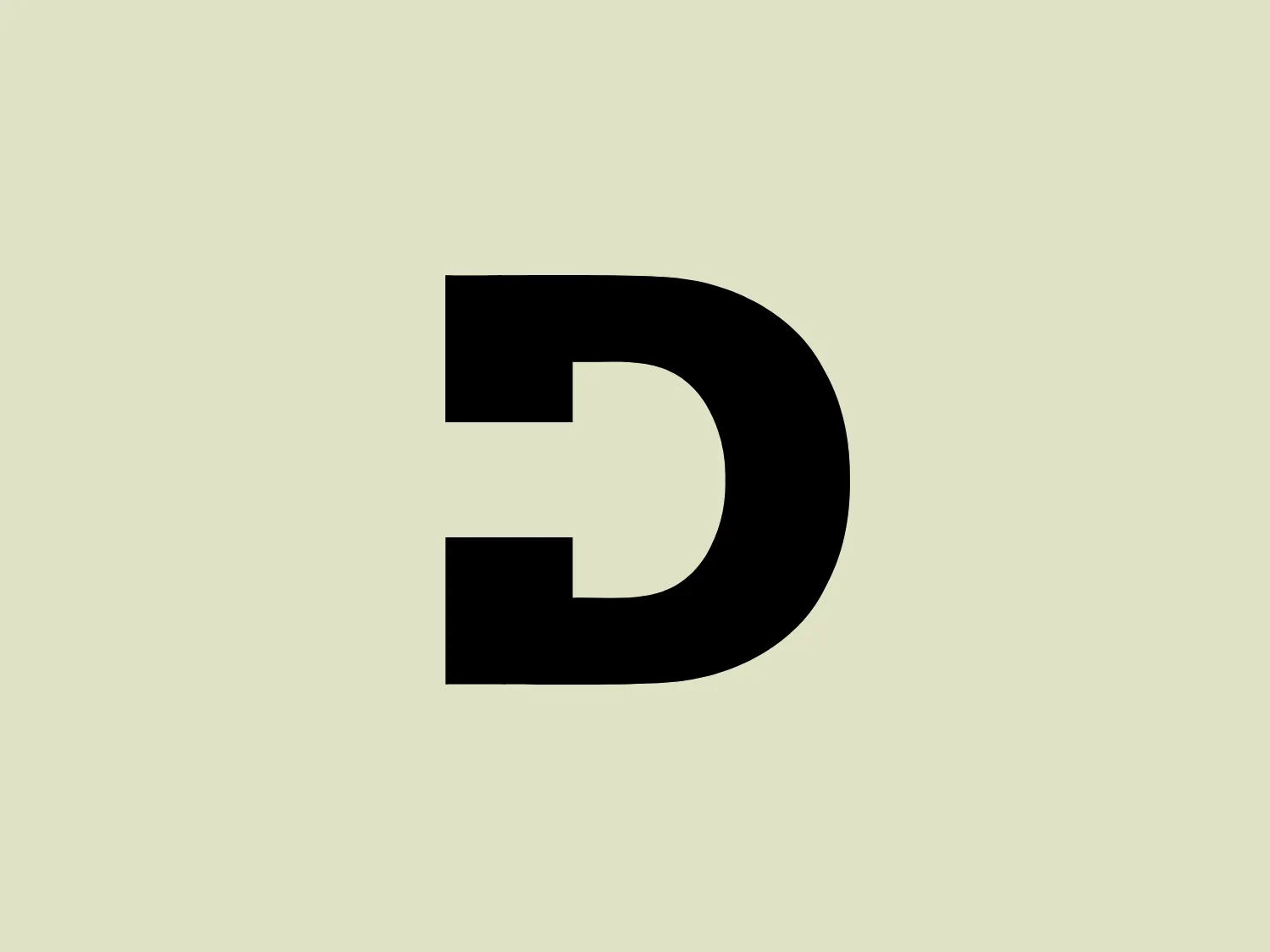
Black Letter D Geometric Minimalist
One thing we like is the bold and distinctive "D" in the Dräxlmaier logo with a clever integration of the letter "C," creating a memorable and visually striking design.
- Color
- Black 953
- Industry
- Manufacturing 127 Automotive 79
- Letter
- Letter D 173
- Location
-
 Germany 281
About the Draxlmaier logo
The Dräxlmaier logo consists of a bold, black "D" with a distinctive design that merges aspects of the letters "D" and "C." Its geometric shape is thick and well-defined with a clean, minimalist look, giving it a modern and professional appearance. The right side of the "D" smoothly transitions into a straight vertical line, while the curved part sharply cuts inward at the top and bottom, creating an impression of a "C" tucked within. This play on letterforms makes the logo memorable and visually striking.
About Draxlmaier
The Dräxlmaier Group is a company that specializes in the development and manufacturing of complex wiring harness systems, central electrical and electronic components, exclusive interiors, and customized storage systems for electro-mobility applications.