Alzheimer Nederland Logo
Black Letter A Minimalist Circular
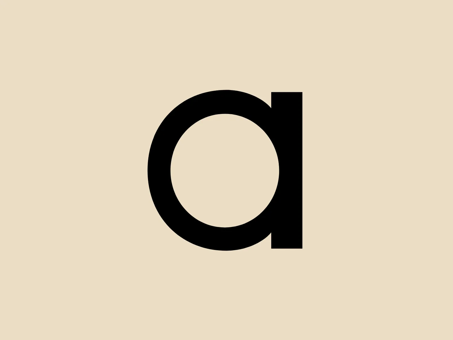
What catches our eye is the minimalist design and clever use of the letter "d" and circular shape in the Alzheimer Nederland logo.
- Color
- Black 958
- Industry
- Healthcare 89
- Letter
- Letter A 352
- Location
-
 Netherlands 80
About the Alzheimer Nederland logo
The Alzheimer Nederland logo showcases a minimalist design with a stylized letter "d" adjacent to a circular shape that resembles the letter "o" or "a." The logo is rendered in bold black, creating stark contrast against a white background. Reflecting a modern and clean aesthetic, the graphic simplicity makes it versatile for diverse branding purposes. The seamless transition from a straight vertical line into a circular form within the letter "d" conveys a sense of unity and continuity.
About Alzheimer Nederland
Alzheimer Nederland is dedicated to addressing the significant challenge of dementia. The organization's goal is to prevent or find a cure for dementia.