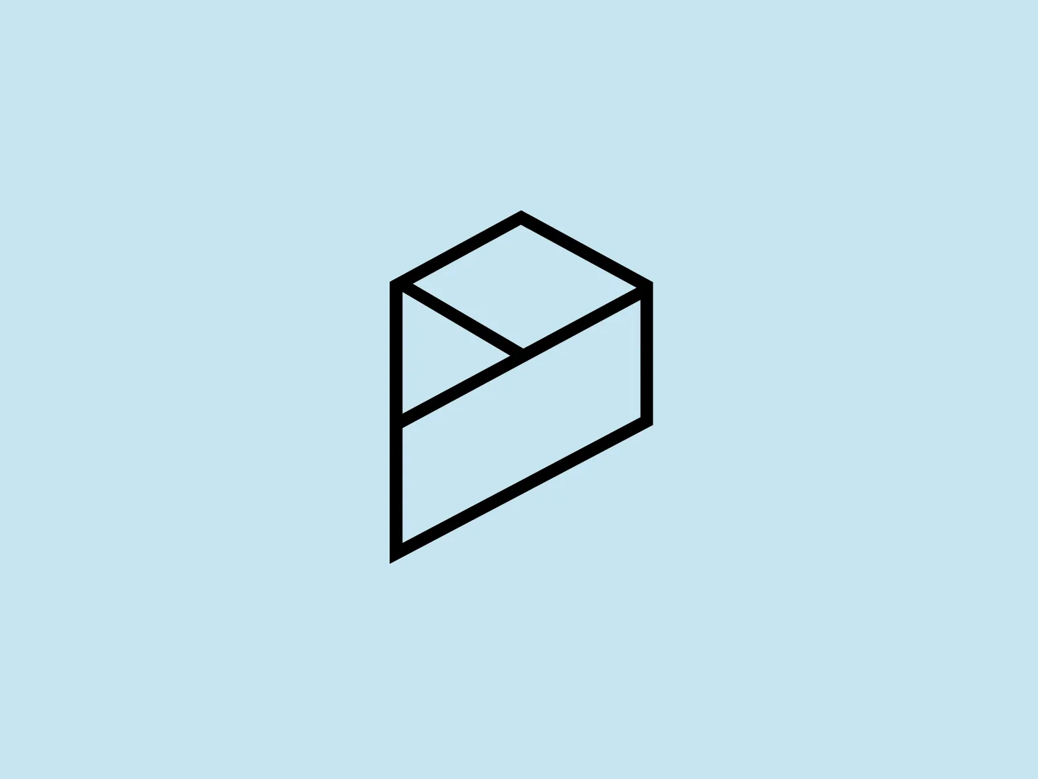
Ninth Page Logo
Black Abstract Minimalistic
The Ninth Page logo's clean, bold lines and minimalistic geometric design make it versatile and modern.
- Style
- Minimalistic 260
- Color
- Black 978
- Industry
- Technology 709 Media 294
About the Ninth Page logo
The Ninth Page logo features a stylized, abstract geometric shape that resembles a three-dimensional box or an open envelope. It is composed of bold, black lines that form the outline of the shape with a visible diagonal line dividing the front face of the box. There are no additional colors within the shape, maintaining a monochromatic and minimalistic design. The lines are crisp and meet at sharp angles, giving a clean, modern aesthetic. The simplicity of the design allows for versatile use across various mediums.
About Ninth Page
Ninth Page (fr: <em>Neuvième Page</em>) is a studio specializing in the design and production of web-based adventures. The studio prides itself on crafting custom, innovative digital experiences with a passionate team of skilled artisans.