Mecklenburgische Logo
Yellow Black Letter M Abstract Stylized
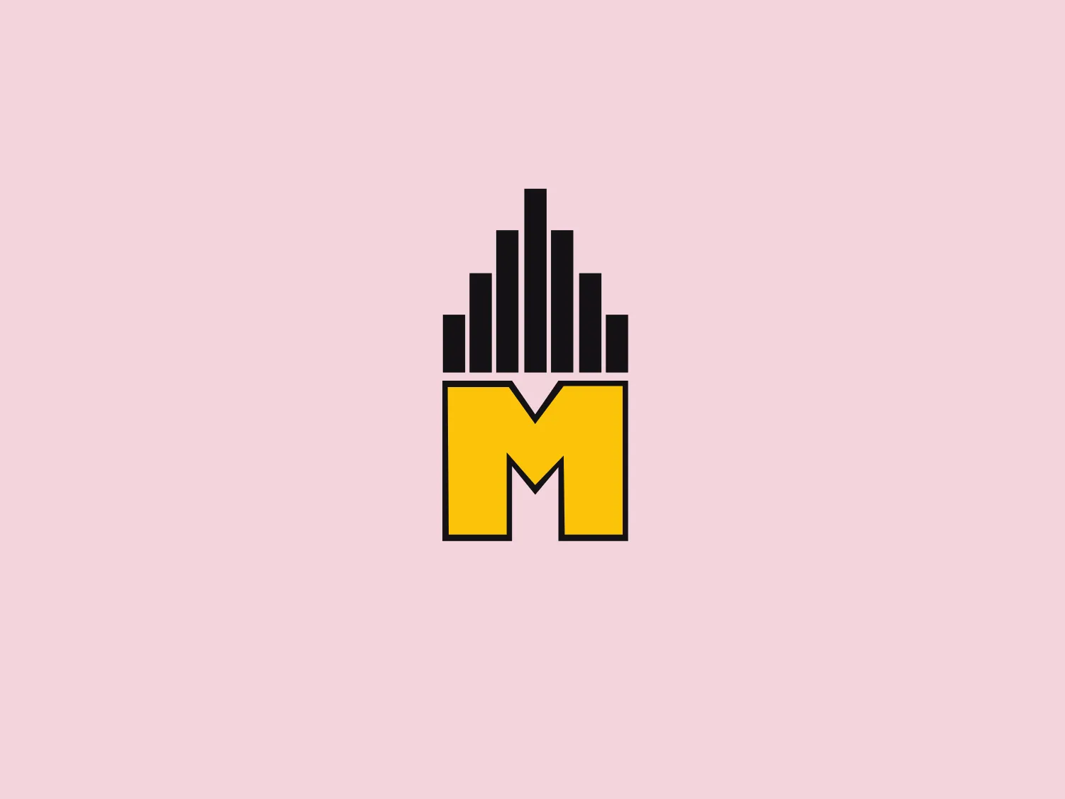
What catches our eye is the vibrant yellow "M" centerpiece and the vertical black bars creating a modern city skyline effect.
- Color
- Yellow 470 Black 956
- Industry
- Insurance 31
- Letter
- Letter M 302
- Location
-
 Germany 282
About the Mecklenburgische logo
The Mecklenburgische logo is made up of a vibrant yellow, stylized capital letter "M" as the centerpiece. Positioned above the "M" is a series of vertical black bars of varying heights, creating an effect reminiscent of a city skyline or sound visualization. The design is characterized by a modern, minimalistic aesthetic, featuring sharp contrast between the yellow and black, and clean lines. The overall impression is one of urban energy and modernity, with a possible connection to music or sound.
About Mecklenburgische
Mecklenburgische is the longest-running private insurance company in Germany, with a nationwide presence spanning over 225 years. The company offers dependable insurance solutions for both individuals and businesses.