Galvanize Logo
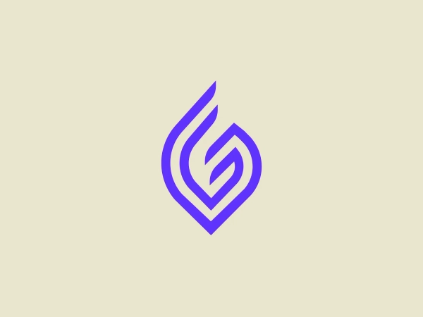
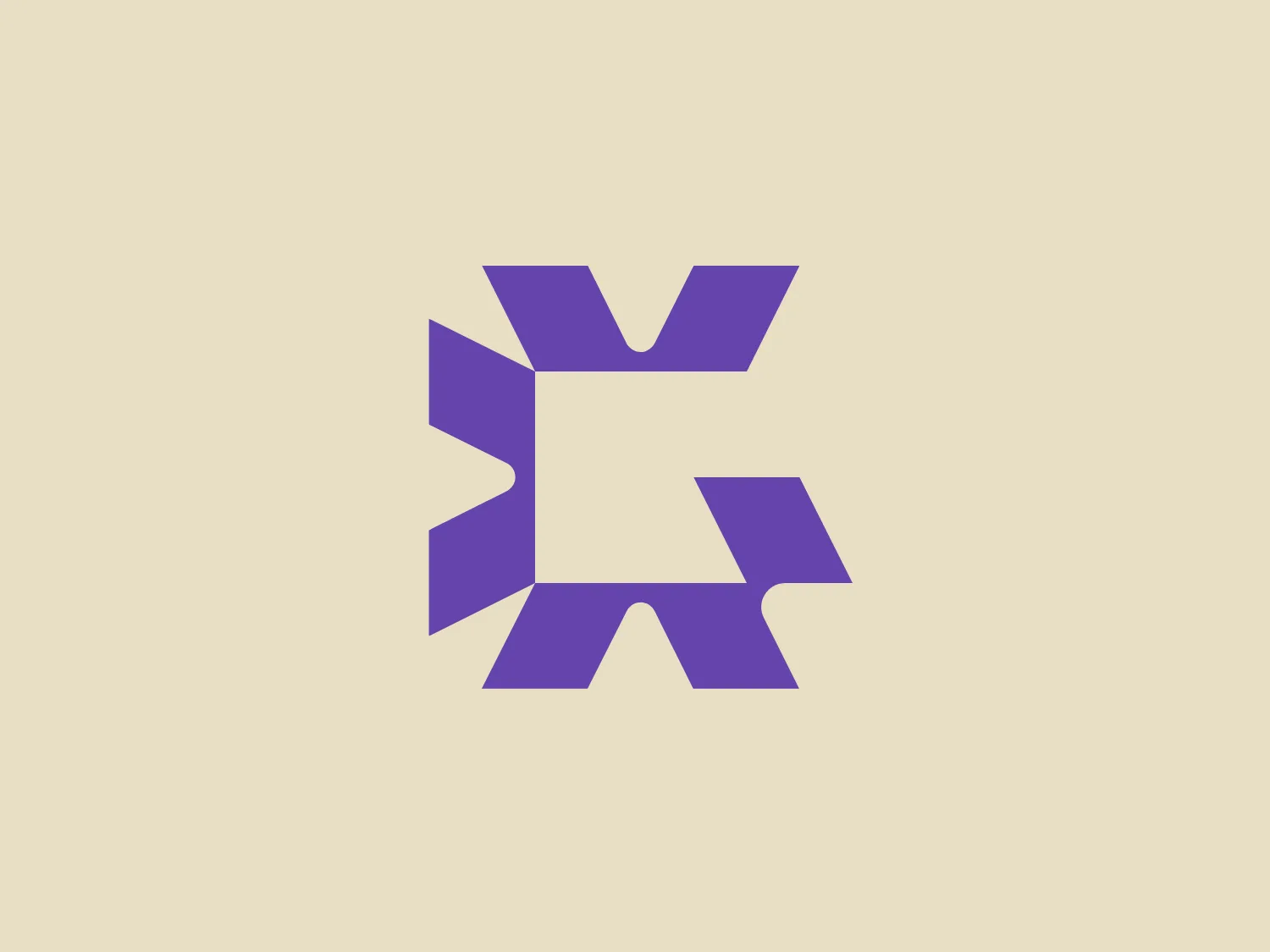
Purple Letter G Geometric Stylized
We like the bold, modern, and dynamic feel of the stylized letterform logo for Galvanize.
- Color
- Purple 354
- Industry
- Technology 688 Software 200
- Letter
- Letter G 214
- Location
-
 Canada 197
About the Galvanize logo
The logo for Galvanize is a stylized letterform that conveys the impression of both an 'X' and a 'K.' It is formed from geometric shapes, consisting of two pairs of symmetrical, angular parts resembling arrowheads pointing outwards from a central square. The design is bold and modern, offering a dynamic feel, hinting at movement or transformation. The logo is a solid, vibrant shade of purple, infusing it with an air of creativity and innovation. Its clean lines and angularity make it stand out effectively on a minimalist and subtle background.
About Galvanize
Galvanize, formerly known as ACL Services, is a global company specializing in the development of security, risk management, compliance, and audit software solutions for major organizations worldwide.