Clarion Call Logo
Orange Letter C Figurative Abstract
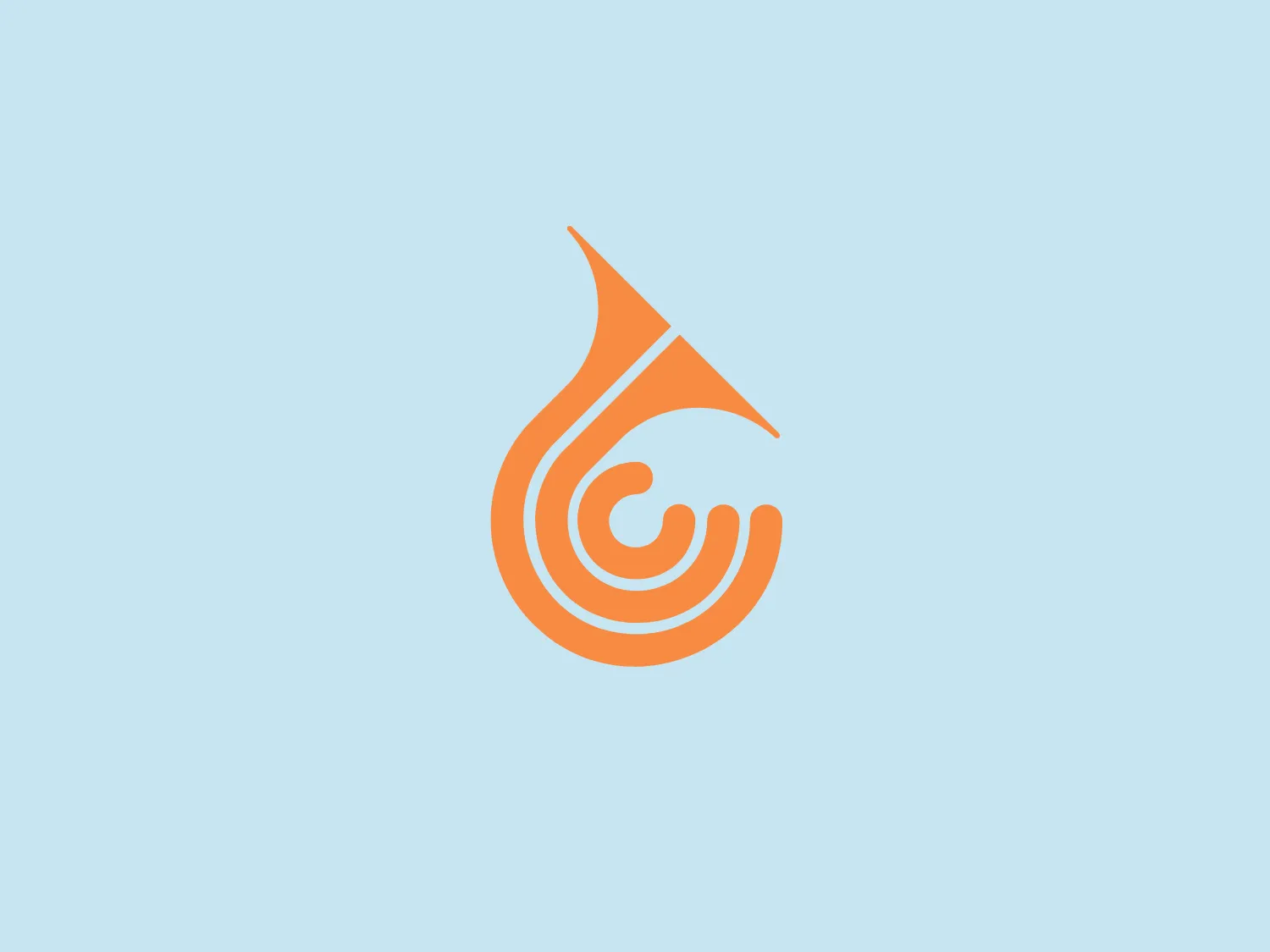
What we like: The Clarion Call logo uses a dynamic, abstract design and vibrant gradients to evoke creativity and motion.
- Color
- Orange 580
- Industry
- Marketing 115 Advertising 97
- Letter
- Letter C 232
- Location
-
 Australia 145
About the Clarion Call logo
The Clarion Call logo features a stylized, abstract design resembling a flame or a drop with dynamic swirls inside. The smooth, curved lines create the impression of motion and transformation. The main color is a gradient of warm oranges, from a lighter peach near the center to a deeper, richer orange at the edges, giving it a vibrant, energetic feel. The design evokes a sense of creativity and fluidity.
About Clarion Call
A clarion call is a powerful, emotive appeal to individuals to drive change and prompt action, requiring the call to action to be impactful, unmistakable, and persuasive.