Tatsumi Planning Logo
Navy Blue Letter T Abstract Geometric
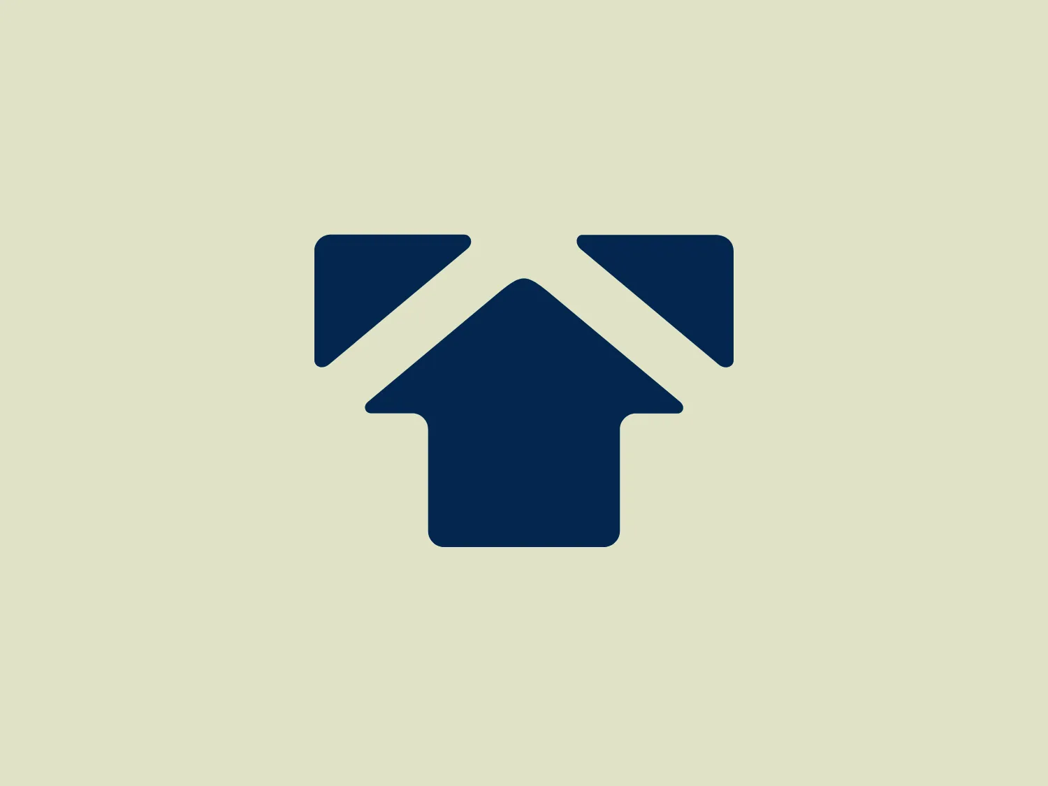
What we like: A sleek, minimalist logo in deep blue, cleverly using geometric shapes to form an abstract house with a subtle 'X' element, offering versatility.
- Industry
- Real Estate 108 Construction 112
- Letter
- Letter T 182
- Location
-
 Japan 68
About the Tatsumi Planning logo
The image features a modern and minimalist logo with a deep blue, almost navy color that shapes an abstract representation of a house. The house shape is created by a combination of geometric figures: three triangles and a quadrilateral. The top triangle, pointing upward, symbolizes the roof. On either side, the two smaller triangles represent an abstract form of the eaves. Below the three triangles, the quadrilateral completes the house silhouette with its broader base, suggesting a sturdy foundation. The negative space between the shapes forms a stylized 'X', which adds a layer of visual interest to the design, implying a sense of structure and interconnectivity. The simplicity of the design allows for versatile use across various mediums.
About Tatsumi Planning
Tatsumi Planning is a professional home construction company that specializes in building custom homes tailored to fit the unique lifestyle and preferences of each customer. They use high-level proposals and advanced technology to deliver top-quality homes.