Acme United Logo
Navy Blue Letter A Circles Overlapping
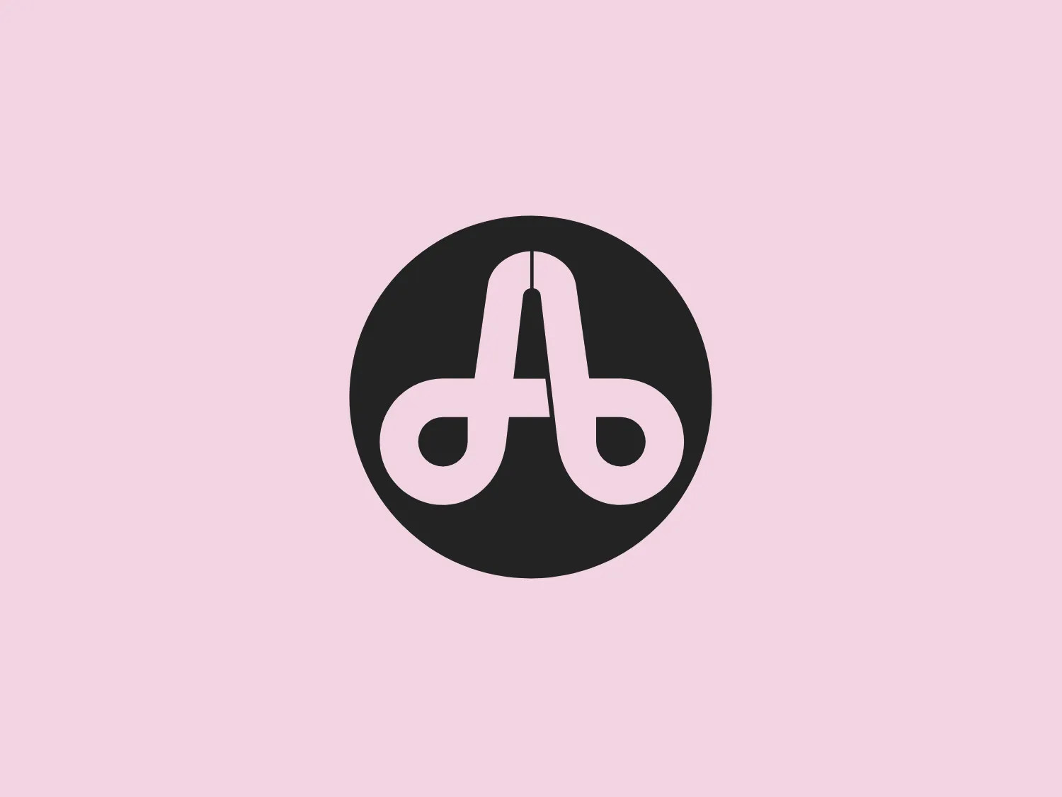
What catches our eye is the clever fusion of the stylized letter "A" and the lowercase "b" within a circular shape, creating a sense of unity and cleverly conveying dual letters.
- Industry
- Manufacturing 127
- Letter
- Letter A 353
- Location
-
 United States 1715
About the Acme United logo
The logo in the image from Acme United consists of a simplistic yet modern design featuring overlapping letter elements within a circular shape. The primary element appears to be a stylized letter "A" crafted to also resemble a lowercase "b", demonstrating a clever fusion of two characters into one flowing design. The logo is monochrome, with the letter element in a crisp white set against a solid navy blue background. The rounded typography and the circular backdrop create a sense of completeness and unity, while the negative space cleverly conveys dual letters. The minimalist design ensures versatility and readability.
About Acme United
Acme United Corporation has been a leading global provider of innovative products in the categories of cutting, measuring, first aid, and sharpening for over 150 years.