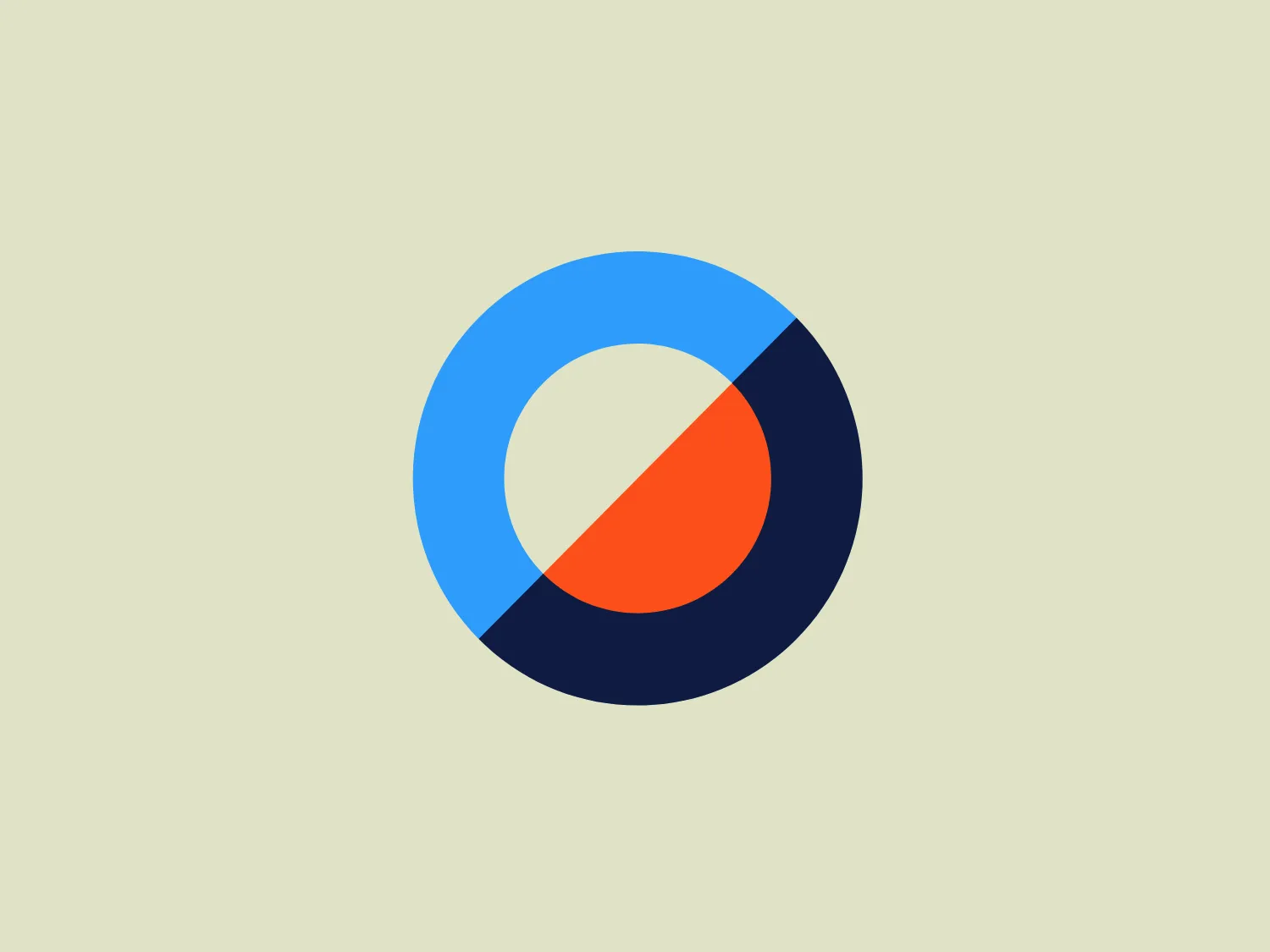
Equinox Resources Logo
Blue Orange Letter O Circle Diagonal
What we like: The modern, minimalist design and vibrant colors make the Equinox Resources logo stand out with a clean and professional appeal.
- Color
- Blue 1488 Orange 547
- Industry
- Mining 9 Natural Resources 9
- Letter
- Letter O 252
- Location
-
 Australia 143
Use this logo
The Equinox Resources logo is a trademark of its owner, shown here for design reference only. Request removal
About the Equinox Resources logo
The Equinox Resources logo features a modern and minimalist design, comprising a circle bisected by a diagonal line that creates two distinct halves. The top half is a vibrant blue (#377DFF), while the bottom half is a bold orange (#FF6A3D). At the center of the circle is a white circle, which creates a sense of depth and contrast. This central white circle's diameter is approximately one-third of the overall circle. The logo's use of complementary colors and simple geometric shapes gives it a clean and professional appeal, suitable for a variety of contemporary brands or apps. The combination of blue and orange also suggests a balance between cool professionalism and warm, friendly service.
About Equinox Resources
Equinox Resources is a publicly-traded company listed on the ASX, focusing on the exploration and development of iron ore, lithium, and other commodities essential for future sustainability.