Rdio Logo
Blue Letter O Letter Arrow
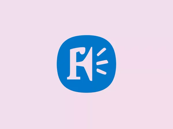
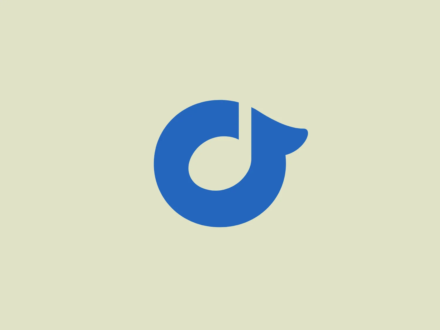
What catches our eye is the Rdio logo's minimalist and modern design, featuring a bold, stylized letter "d" with a distinctive arrow-like appearance, conveying a sense of progress and innovation.
- Industry
- Entertainment 338 Media 288
- Letter
- Letter O 252
About the Rdio logo
The Rdio logo features a stylized letter "d" with a distinctive design that links the straight stem of the letter to a curved form, creating a closed loop with an arrow-like appearance at the end. The letter is rendered in a bold, saturated shade of blue that implies dependability and strength. The design is minimalistic and modern, with a sense of motion implied by the arrow, suggesting progress or forward movement. The aesthetic is clean and would likely appeal to a tech-savvy or innovative audience.
About Rdio
Rdio was a digital music service provider that offered innovative music discovery, listening, and sharing experiences. The company was later acquired by Dhingana.